Bootstrap is amazing. When it was released it improved the design of a huge number of sites!
However its popularity also meant that -along the years- the out of the box design was no longer unique and flashy.
In this tutorial we will see how to edit bootstrap at the sass level, allowing use to change fundamental things of our design system.
Since the latest releases (9.3 and 9.4) Next.JS will compile sass out of the box. No need to reconfigure anything.
Furthermore the Fast Module Reload feature also released makes for an amazing DX, allowing us to change the styles, without losing state.
These two combined make iterating on the application design a super nice experience
Let’s see if we can use these features to use all the goodies that bootstrap provides, without having a site that looks like “another site built with bootstrap”
So, let’s start, create the app by running:
npx create-next-appWhile that is loading, download the source files of bootstrap here
Extract the zip to a folder and copy only the scss folder to the root of your project
And now, install Bootstrap for React and also sass
yarn add react-bootstrap sassNow, create a folder called styles, and inside of if create a file named customTheme.scss
Inside the pages directory, create a custom _app.js file like this:
import '../styles/customTheme.scss'

function MyApp( { Component, pageProps } ) {
    return <Component { ...pageProps } />
}

export default MyApp
Now, inside styles/customTheme.scss write the following:
//Your customizations must come before bootstrap import

$enable-shadows: true;
$primary: rgb(0, 19, 223);


$body-color:  #333;
$body-bg: #f2f2f2;

@import '../scss/bootstrap.scss';
and we are done!
To test it out, override the default index page with:
import Head from 'next/head'


import { Container, Row, Col, Navbar, Nav, NavDropdown, Form, FormControl, Button } from 'react-bootstrap'


const Home = () => (
  <>
    <Head>
      <title>Create Next App</title>
      <link rel="icon" href="/favicon.ico" />
    </Head>


    <Navbar bg="light" expand="lg">
      <Container className="container-fluid">
        <Navbar.Brand href="#home">React-Bootstrap</Navbar.Brand>
        <Navbar.Toggle aria-controls="basic-navbar-nav" />
        <Navbar.Collapse id="basic-navbar-nav">
          <Nav className="mr-auto">
            <Nav.Link href="#home">Home</Nav.Link>
            <Nav.Link href="#link">Link</Nav.Link>
            <NavDropdown title="Dropdown" id="basic-nav-dropdown">
              <NavDropdown.Item href="#action/3.1">Action</NavDropdown.Item>
              <NavDropdown.Item href="#action/3.2">Another action</NavDropdown.Item>
              <NavDropdown.Item href="#action/3.3">Something</NavDropdown.Item>
              <NavDropdown.Divider />
              <NavDropdown.Item href="#action/3.4">Separated link</NavDropdown.Item>
            </NavDropdown>
          </Nav>
          <Form inline>
            <FormControl type="text" placeholder="Search" className="mr-sm-2" />
            <Button variant="outline-primary">Search</Button>
          </Form>
        </Navbar.Collapse>
      </Container>
    </Navbar>


    <Container className="container-fluid">

      <Row className="pt-5">
        <Col className="my-auto">
          <h1 className="display-2 font-weight-bolder">
            <strong>
              Next.JS + Bootstrap
            </strong>
          </h1>
          <p className="lead">
            Liked this tutorial?
          </p>

          <a className="btn btn-primary btn-lg" href="https://twitter.com/mike_alche">
            Follow me on twitter
            </a>
        </Col>
        <Col className="">
          <img className="rounded " src="http://placekitten.com/500/500" alt="" />
        </Col>
      </Row>
    </Container>

  </>
)

export default Home
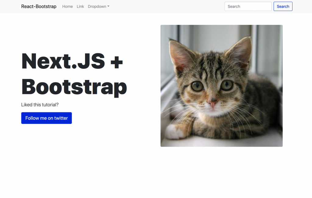
As you can see the we’ve overrided the $primary variable in the customTheme.css file, and now we show a nice purple insted of the default blue:

Ok, we only changed some colors, maybe the bootstrap look is still there, but… maybe I’ll make a second part in which I go deep and edit several things of the bootstrap sass files, so we can create a truly unique theme! Please send me an email if you’d like to see that
Closing thoughts
Hope you liked this tutorial!
If you see an error, or have any suggestions please send me an email or comment it below!
Be sure to explore all the things bootstrap allows you to customize in here